Monte Carlo is a term you’d be hearing a lot when talking about equity curves along with terms like “path dependency”. This post is NOT about Monte Carlo. The problem with this term is that it comes with a lot of baggage. The baggage is not in what Monte Carlo is, but how to go about doing it. And no, I WON’T be teaching that either. This post is about trying to conceptually grasp the stuff underlying Monte Carlo. The icky stuff relating to distributions and probability and other stuff. This article is going to get really dense, but I promise to go slow, and urge you to do the same.
Monte Carlo in its essence is a simulation method. For eg. suppose you look at the curve of the BTST strategy discussed HERE. The cumulative returns curve looks pretty enticing. But suppose, a lot of the negative return days bunched together instead of being more spread out. Suddenly, the curve looks like it has a massive drawdown during that period. This property of cumulative return curves changing drastically due to rearrangement of order of returns is called “path dependency“. Since this is a risk that could blow out your capital (when dealing with leveraged products), you should want to see what all paths the return curve can take vs. the actual path taken in the backtest.
This can be accomplished by 2 methods:
1. Reusing the original return data: By rearranging, resampling, removing and replacing the data points randomly. This method is called “BOOTSTRAPPING“. There are readymade packages which help you do just this, in most programming languages.
2. Generating new data similar to the original data: This is the MONTE CARLO method, in which you create random numbers which replicate the probability distribution of the original data.
UNDERSTANDING PROBABILITY DISTRIBUTIONS
Suppose you have a string of numbers which are the original returns of the BTST strategy (Gap returns, yesterday’s close to today’s open). I’ll ask a string of questions to home in the point:
1. What is the probability of positive returns?
2. What is the probability of a specific magnitude of return (say, 1%)?
3. What is the probability of having returns at least 1%?
4. Is there any general purpose method of visualizing probability of every magnitude?
5. Is there any general purpose method of visualizing question 3, for every magnitude?
Question 1 is easy to answer. Positive returns/total returns*100. For BTST (since 1991), it is 4369/6902*100=63.33%
Question 2 is also easy to answer. Number of returns exactly=1/total number of returns*100. For BTST, 630/6902*100=9.13%
Question 3 is also similarly easy. Number of returns >=1/total number of returns*100. For BTST, 192/6902*100=2.76%
Question 4, is where you will trip up. The problem is that when we think of returns of 1%, we are thinking of the number exactly equal to 1. But when we calculate returns as percentages, it rarely equals exactly equal to a single specific number. The 10.75% that I got for question 2, is due to rounding off the gap returns to 2 decimals. 1.003 also becomes 1, in this context. But a general purpose method won’t look at each number as a discrete quantity. A general purpose method needs to have the flexibility for incorporating any number of decimals that it can work with. This is where “probability density functions” (PDF) come into the picture. The PDF tells you the probability of getting a number between the [largest lesser number to the left] and the [smallest larger number to the right] of your desired magnitude (read this line again and again until it starts making sense).
In effect, this is a “smoothed over histogram”, when frequency of occurrence of a single magnitude has been converted to probability of occurrence. So, don’t get disheartened by the technical nature of description, read the next paragraph.
The shape of this PDF is the most important thing you need to replicate when trying to generate random data similar to the original data. The probability of occurrence of each generated data point should be similar to the original data of similar magnitude.
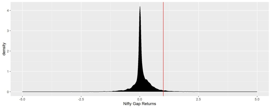
PS. Technically, the “density” in PDF means the rate of change of probability of getting the next higher number from current number (it is a small point, but not very useful to us. Just remember this when you see the y-axis in density graphs going more than one, since probability can’t go more than one – don’t get confused by this).
If you’ve understood the answer to Q.4, then Q.5 is more intuitive to understand. Another way of representing the density plot is to do a cumulative sum of the probabilities for each magnitude and plotting it against the actual returns – “Cumulative Density Function (CDF)”. The same for Nifty Gap returns is shown below. The steepness of the slope in the middle of the graph is proportional to sharpness of the peak in the PDF graph.
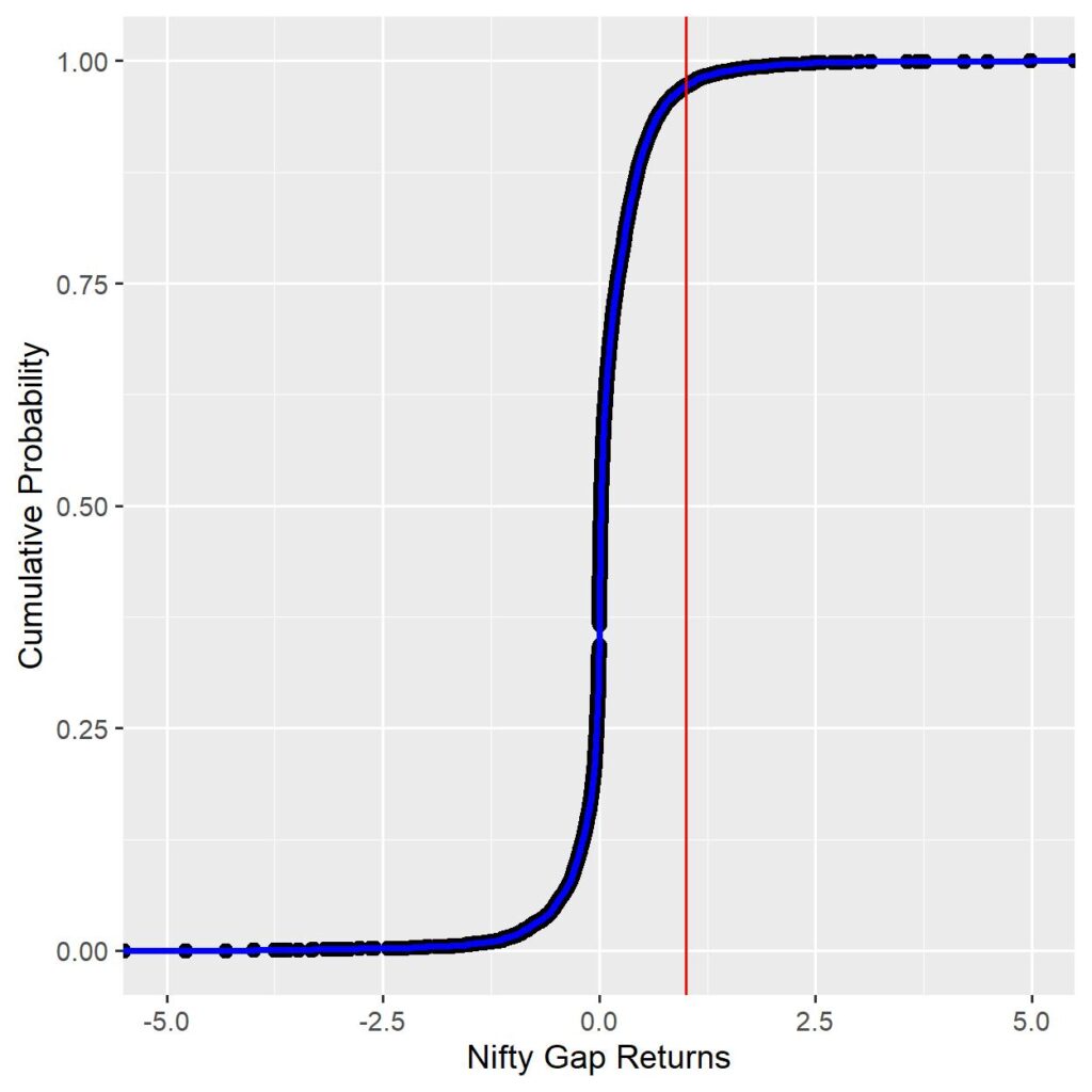
The Cumulative probability at the red line is 97.23%. This tells you that the probability of any day’s Nifty gap returns <=1% is 97.23%. Or conversely, any day’s Nifty gap returns being >=1% is 2.76%. Using this, probability can be obtained for any magnitude of Nifty gap return you can think of.
Take home message from above exercise: Computing CDFs help you get the probabilities associated with any specific magnitude of return, and drawing a PDF will help you get the shape of the probability distribution you’ll need to target for generating random data for Monte Carlo paths.
UNDERSTANDING THE SHAPE OF PROBABILITY DISTRIBUTIONS
Any visual shape can be described mathematically using specific parameters. For example, a square can be described by height and width.
When it comes to probability distributions, there are a few extra considerations.
1. Are all the magnitudes at similar levels of occurrence (Uniform distribution),
2. Or are they concentrated around one or more magnitudes (number of peaks – unimodal for 1 peak, bi/multimodal etc.)
3. Where is the peak concentration – the measure of central tendency (mean, median, mode)
4. Is the peak concentration too high or too low at the central point? How sharp or blunt is the peak – Kurtosis.
5. How spread out are the magnitudes about the central point – measures of dispersion (variance, standard deviation)
6. Is the spread symmetrical about the central point? If not how asymmetrical is it – Skewness.
These parameters are called moments of probability distribution. First moment is the Central tendency measure, Second moment is the Dispersion measure, third moment is Skewness and fourth moment is Kurtosis.
Using these parameters multiple different types of distributions have been described. The most well known one is the Standard Normal Distribution (Gaussian). Others are Weibull, LogNormal, Gamma, Beta, Laplace etc etc. There are too many to recount, but understand that all of them are drawn based on specific limits of the four moments that we talked about.
For example. The standard Normal has a mean of 0 and a standard deviation of 1, skewness is 0 (perfectly symmetrical) and kurtosis of 3. Based on these properties, you can either look for the type of distribution you want manually, or let an automated procedure do it for you.
We will try to find a match for our Nifty Gap returns PDF manually and automated so that you understand the process.
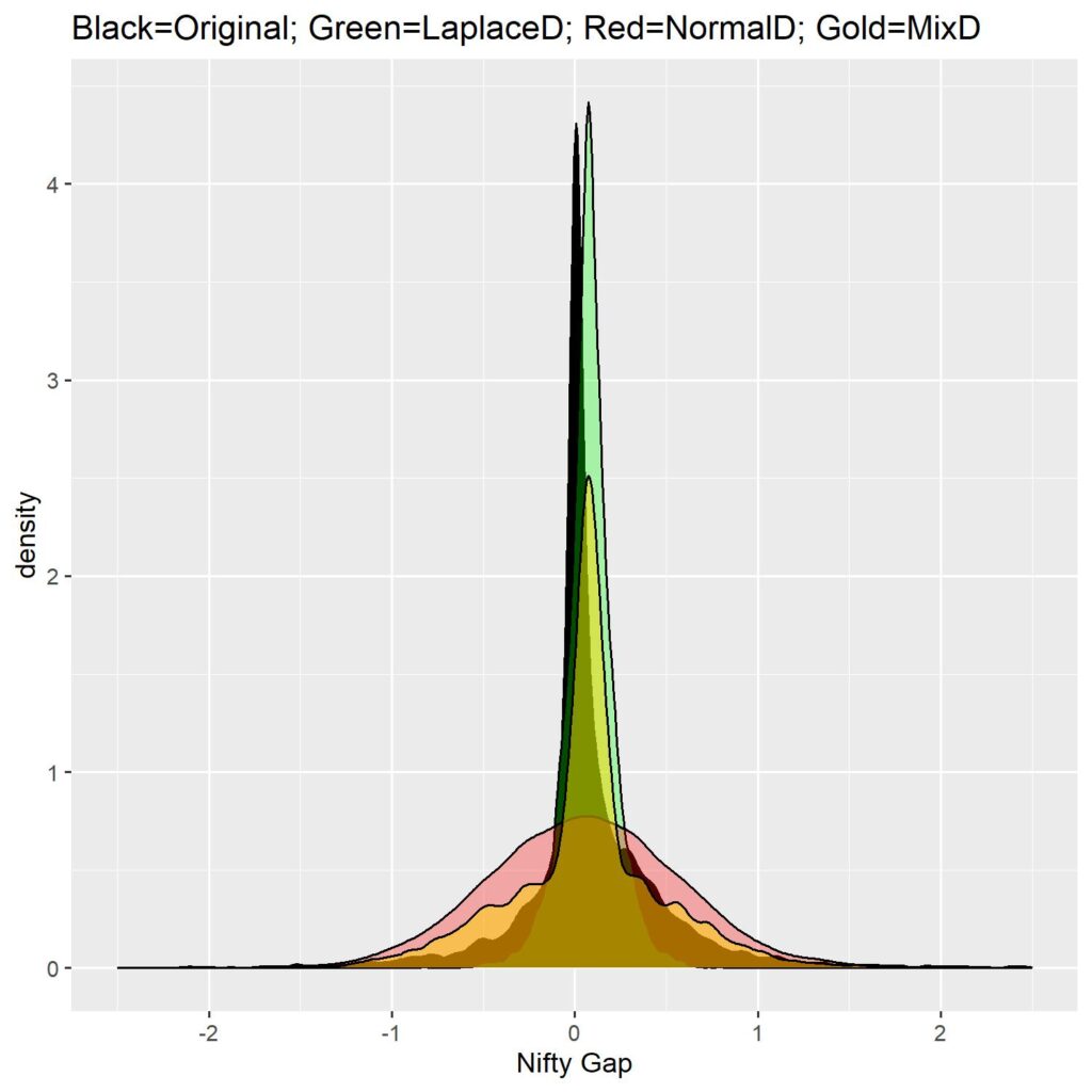
The figure below shows you how our Nifty Gap returns PDF compares against a Normal distribution, a Pearson type VI distribution and a double exponential (Laplace) distribution.
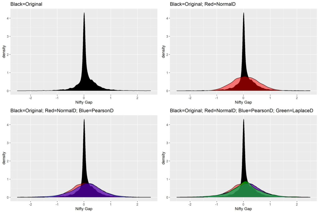
Looking at the figure you can surmise that none of the distributions are even close the approximating the stunning concentration of Gap returns around 0.
Looking at the first panel, you can observe that there is a slight skew in the returns (meaning larger number of positive returns than negative). The skew is exactly -0.982.
The extreme concentration around the mean (0.077), means there is a high kurtosis (44.36).
The SD of the returns is at 0.497.
Using the above computed moments, we shall try to match distributions (Normal Dist is definitely out of the picture)
LAPLACE DISTRIBUTION MANUAL FIT
First, let’s try double exponential or Laplace distribution. This distribution has a property of faster rise of probabilities towards the peak, and hence larger kurtosis. We shall generate random numbers of Laplace probability distribution based on the given moments of the Nifty Gap PDF. The fourth panel in the above figure shows the Laplace distribution in green against the Original distribution in Black. Notice the slight higher peak compared to normal distribution (Red), but still far shorter than what it needs to be. Another problem with the Laplace is that we cannot modify the skew (it is perfectly symmetrical).
To improve the fit vis a vis the Original distribution, we can try to reduce the standard deviation by some constant and see whether it matches up. The below video shows the change in the Laplace distribution shape when we divide the Original Gap SD by a constant called VarDiv (made up by me, ranging from 1 to 5 in steps of 0.1).
In the video, you will notice how the random deviates from the Laplace Dist have a progressively smaller dispersion (the base) and the kurtosis (peak) keeps climbing. The last image of the video will help you appreciate that capturing the kurtosis comes at the expense of the dispersion. Since the kurtosis of the original PDF is due to massive numbers of small gap returns, that is the most important part of the distribution. But if we use this, we will miss out on observing the risk of the tails (less frequent, but large gaps).
Also, this doesn’t capture the skew (larger numbers of positive returns vs negative returns) due to inherent symmetry of the Laplace distribution.
CHECK FIT AGAINST COMMON DISTRIBUTIONS
Since the manual isn’t working out so well, let’s try the automated method and see which distributions come close to ours.
For this I will use the “fitdistrplus” package of R. This method produces a kurtosis vs skewness plot to see where the common distributions will lie versus our original gap distribution. This plot is known as Cullen and Frey plot.
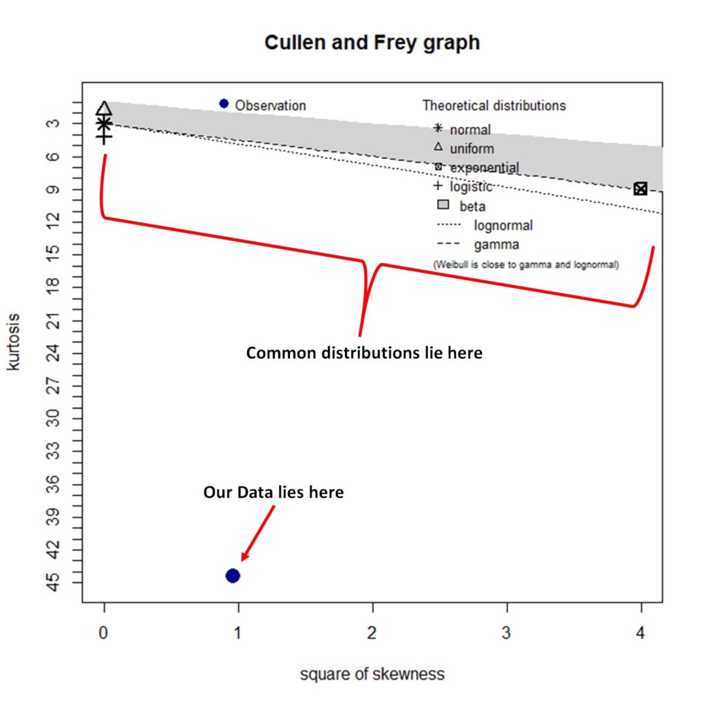
As we can see in the graph, none of the common distributions will fit our data. The kurtosis is just too high vis a vis the dispersion.
OUR TRICK
Since we want a mix of distributions (kurtosis from the Laplace distribution and dispersion from the Normal distribution), I managed to create an empirical distribution which consists of random deviates of Laplace with VarDiv of 5 and random deviates of normal distribution with VarDiv of 3, mixed in such a way that mean ± 1 SD of the Laplace and NOT(mean ± 1SD) of Normal distribution. The mix retains dispersion of normal distribution with most of the kurtosis of Laplace distribution. Check out the figure below.
With the empirical distribution ready with us, we can happily go ahead and create random paths. Easy enough to do in a loop since we know what we need. Since we can’t add up percentage gaps, I chose to represent them as standalone daily values, instead of cumulative paths. The following image is that of original gap data vs all simulated gaps (N=100).
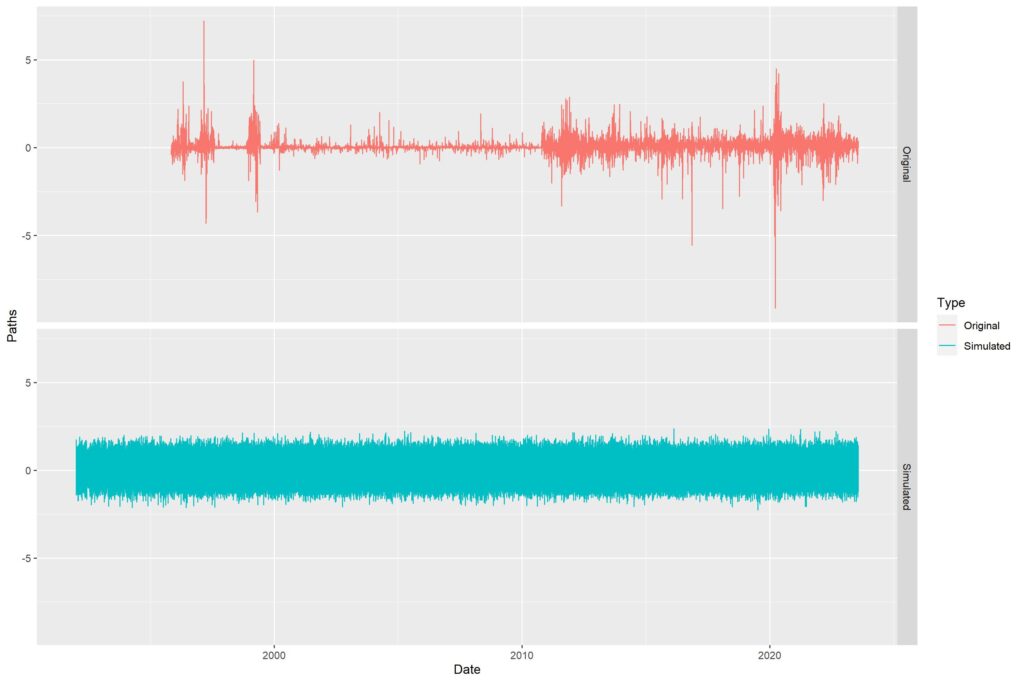
The paths all overlap, so it looks like a mess. Thus, made a video showing all the paths made separately. You will notice that apart from a few huge outlier gaps in the Original data, the distribution is quite evenly matched (as seen in the density graph above). The video is shown below.
As I had said in the beginning of the article, this post is not about Monte Carlo. The post intended to explain probability distributions and how it ties up with Monte Carlo method of path simulation. I hope it was useful, as I’ve tried to reduce the jargon to as minimum as possible.
Cheers to all who managed to reach the end of this humongous article. Will follow up with another article tying up PDF/CDFs with hypothesis testing and maybe go into more details of Monte Carlo methods.
Please comment here or on TWITTER (/X) to ask questions or give criticisms. Thank you all and Jai Hind.
Pingback: Path analysis of Stock trends - Alpha Leaks
Pingback: Does Rebalance timing affect final returns? - Alpha Leaks
Pingback: Duration weighted Stock Momentum Portfolio – The Kalpa Strat - Alpha Leaks